This article was originally published on Medium:
https://medium.com/findworkco/testing-the-invisible-2ac2ccae1101
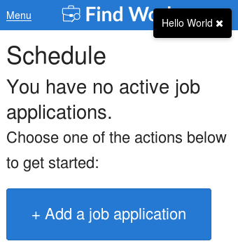
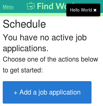
When I started dogfooding Find Work, I found an annoying invisible issue. Try to spot it in the screenshot below:
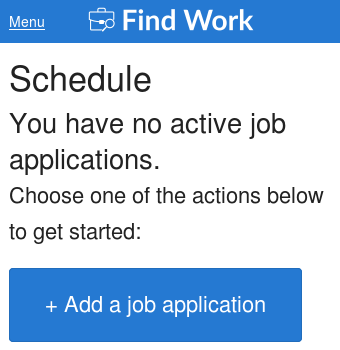
Can’t spot it? Here’s a similar issue that I caught/fixed in development:
To prevent spoilers, I’ll provide some visual spacers:
.
.
.
.
.
.
.
.
.
.
.
.
.
.
Here’s the answer: Our notification container was taking up full width and blocking the "Menu" button:
In the development example, it was our menu button’s container overlaying our logo link:
How do we prevent future regressions for these and similar problems? I can think of a few options:
- JS based test: Load the page in a browser/browser-like environment and verify the container width is not the full page width
- Visual test: Highlight container and guarantee it only takes up the space it needs
I prefer taking the visual test route as it’s simpler (i.e. add a CSS rule) and more intuitive for a developer. The screenshots above are from our visual test suite. Here’s our visual test in Gemini:
gemini.suite('menu-collapsed', function (child) {
  // Navigate to a page that loads our notification
  child.load('/_dev/notification?type=log&message=Hello%20World')
    .setCaptureElements('body')

    // Add highlight to container via CSS
    .before(function addOverlayHighlights (actions, find) {
      actions.executeJS(function handleExecuteJS (window) {
        var document = window.document;
        document.styleSheets[0].insertRule(
          '#notification-container { background: rgba(0, 255, 0, 0.3); }',
          document.styleSheets[0].cssRules.length);
      });
    })

    // Capture across all of our resolutions
    .capture('default-large', geminiUtils.resizeLarge)
    .capture('default-medium', geminiUtils.resizeMedium)
    .capture('default-small', geminiUtils.resizeSmall);
});
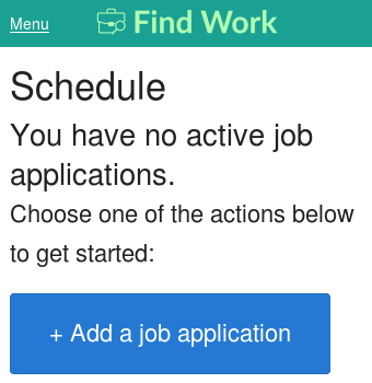
Here are the fixed results from our visual tests:
