This article was originally published on Medium:
https://medium.com/findworkco/designing-find-work-4db8dc5a668b
Now that we have launched, we can talk about our design process freely. This article is going to cover what happened from start to finish.
First things first, I'm a proponent of making things open source so here's our mockups:
https://app.moqups.com/todd@findwork.co/noWM1oiRBn/view
See the "Pages" tab on the left to view our different pages
In case anyone is wondering, I've already reviewed the pages and didn't find any trade secrets hidden in comments. If you do find one, please let us know.
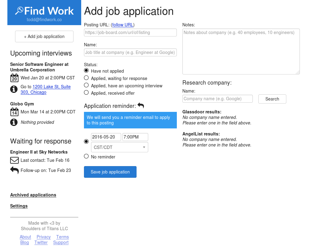
Next, let's post the final result so you know what we're working towards:
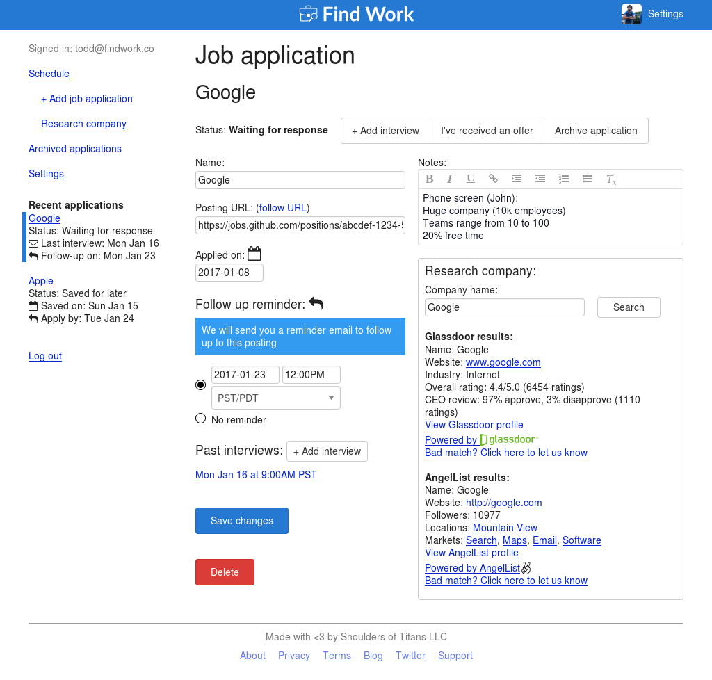
Concept
In the beginning, we had a general idea of the features we wanted (reminders, schedule of upcoming events). I don't think we thought about integrated company research until partially through this stage.
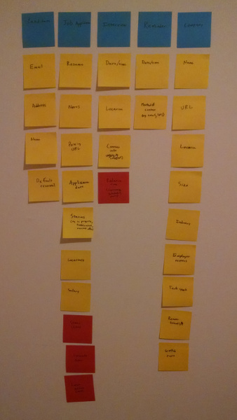
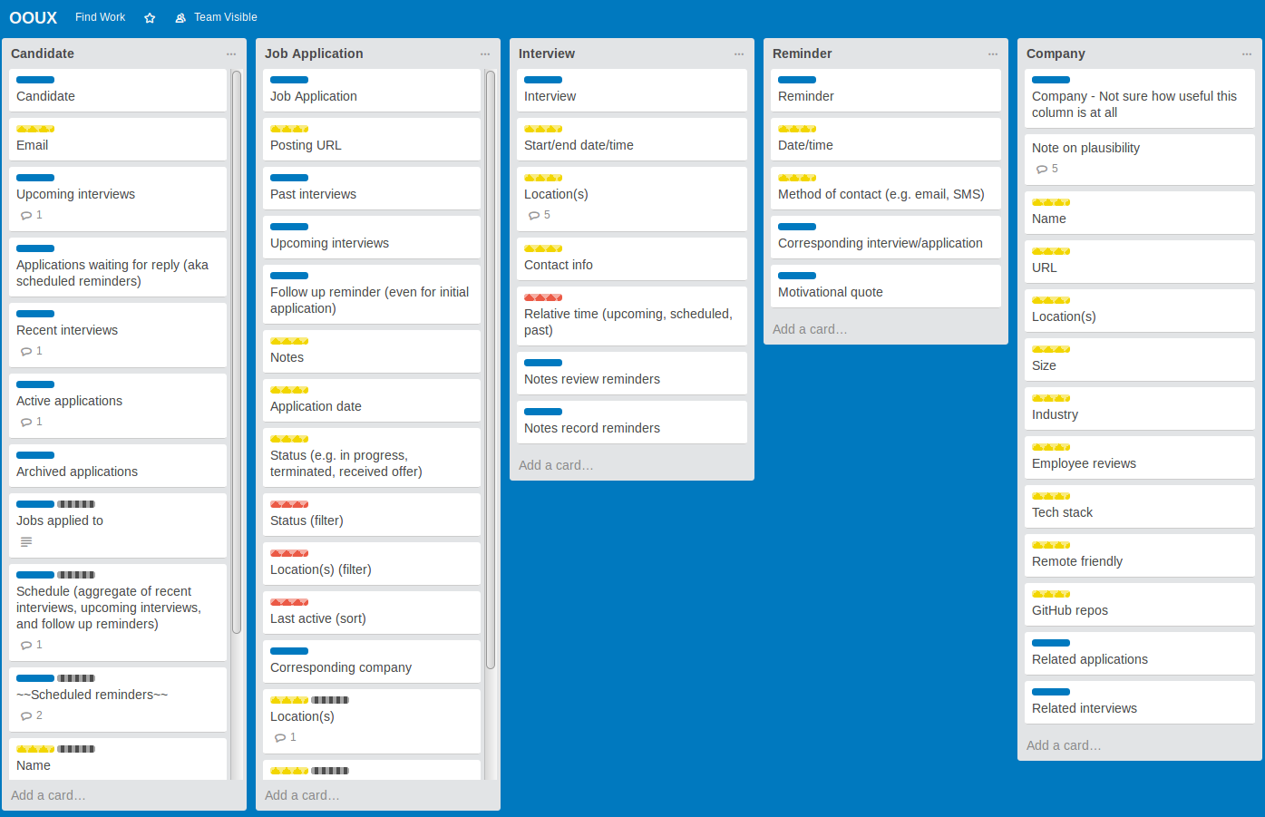
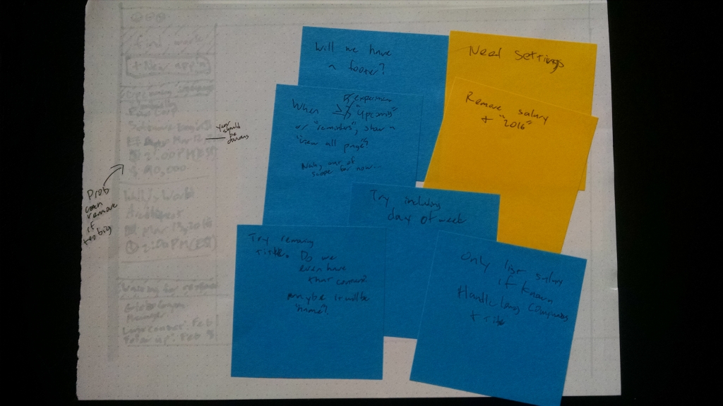
We started with OOUX. Here's our board of sticky notes:
Updating cards by hand got tedious so we moved the cards into Trello and continued iterating there:
We had a few more revisions after this but I'll spare you the details. After this, we had the concepts in our head and began sketching ideas by hand.
Sketching
We were determined to have a glanceable schedule in the navigation and uncertain about the rest of things.
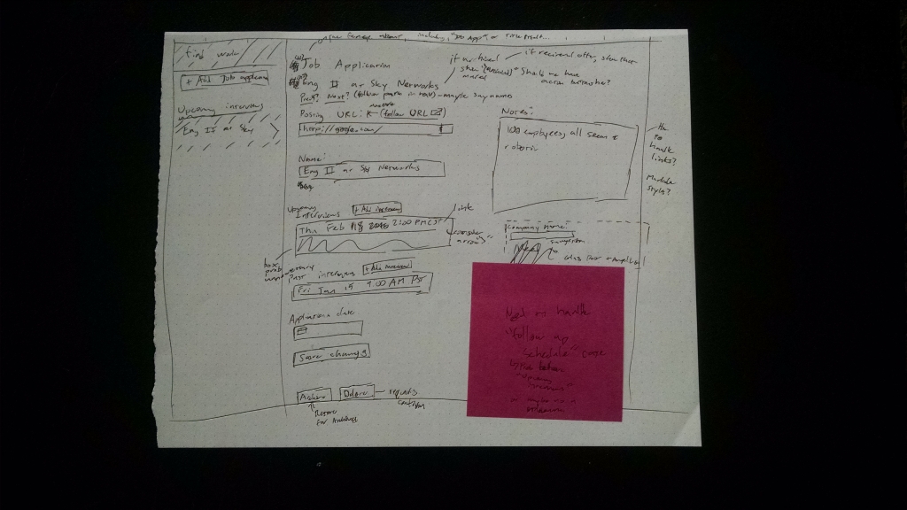
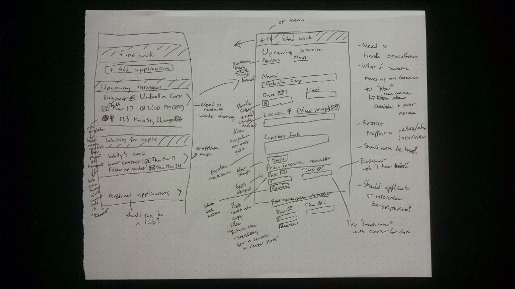
There were 19 paper sketches with some smaller one-offs for ideas/logos. Part-way through, we created a bunch of mock application data as it was getting tedious to think of random-esque dates/application details:
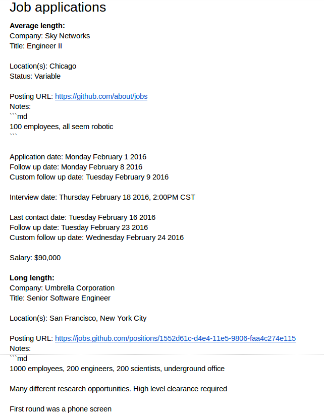
For anyone curious, it's good to design with multiple lengths of text in mind. For example, we could have a short company name (e.g. "bit.ly") or a long one (e.g. "Umbrella Corporation"). The design must be tolerant to both width variants (i.e. not look to empty, can wrap text).
This gets even worse with internationalization and languages like Japanese where text is concise and German where text is verbose.
The mock data turned out to be super useful in development as we reused the same data for prototyping.
Mockups
After we had a gist of direction, we started with mockups via Moqups. This means recreating the paper sketches in Moqups and determining all UI states exist and make sense (i.e. empty, loading, error, complete)
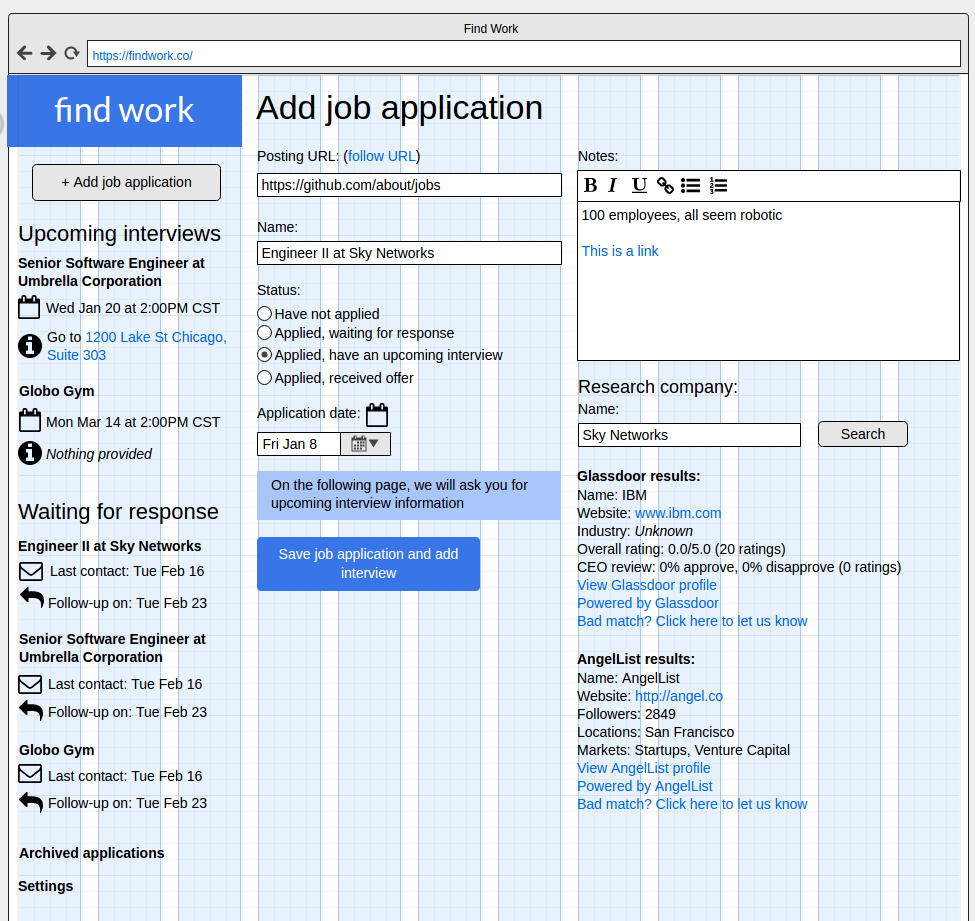
It's a good idea to explore lots of design directions at this stage as it takes a lot more time to iterate/explore in prototyping. You can see plenty of exploration in the "z_Archive" folder:
https://app.moqups.com/todd@findwork.co/noWM1oiRBn/view/page/a478bf142
There was some things we were unhappy about on the first iteration:
- Radio buttons to select application status
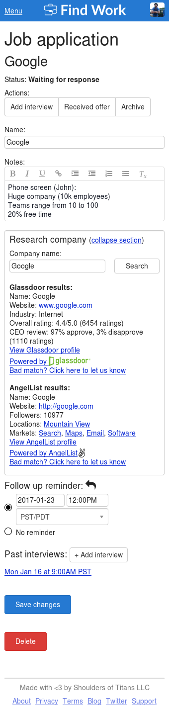
- Navigation on medium/small screens wasn't great as people couldn't jump to other applications
- Logo didn't look great at small sizes
However, we didn't have solutions yet so we moved forward.
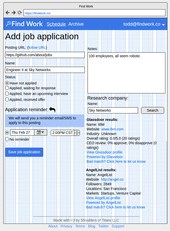
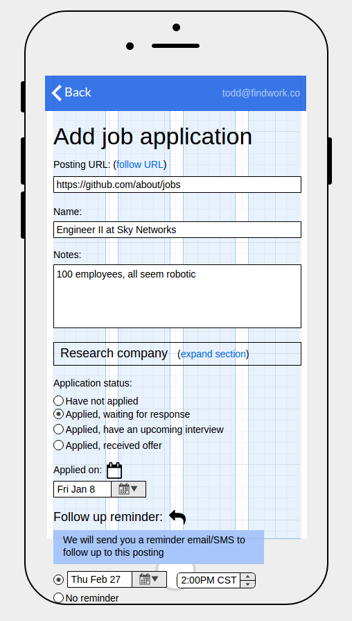
Prototyping
Mockups and HTML/CSS don't always line up precisely so this is metaphorically where the rubber meets the road. We started taking each of our mockups and implementing it. There was no database wired up to this, it was exclusively hardcoded mock data.
Wiring
This is less of a design phase, more of a development phase, but it's worth mentioning. This is when we take our mock data and replace it with a database so people can sign in and interact with our application.
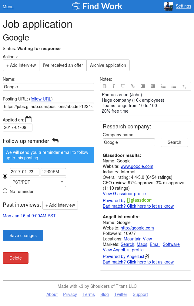
At some point during prototyping and database wiring, we got inspired to solve each of the afore mentioned problems (e.g. status radio buttons). All of which brings us to our final result today: