As a developer knowing design basics has some benefits:
- Better communication with designers due to shared knowledge/vocabulary
- Better architecture for HTML/CSS
- It's hard to build a system without knowing its core principles
What is design?
Design is a broad categorization of many topics, similar to a layperson's definition of "programming" (e.g. varying from Assembly to CSS to networking).
Here are some common design categories:
- Visual/graphic design, to create visual assets such as logos, posters, and advertisements
- User Interaction/User Experience (UI/UX) design, to plan out an application's pages and workflows
- Industrial design, to create, plan, and prototype physical objects
- Examples: Herman Miller, MUJI
We will be focusing on UI/UX design and visual design as these have the most crossover with developer work.
We won't be covering the design process as there are a ton of approaches. For high level notes, please see the Topics not covered section.
Mindset: Good design helps users achieve their goals via intuitive interactions and contextual information. A common phrase in design is:
When there is good design, you will never notice it.
Grids
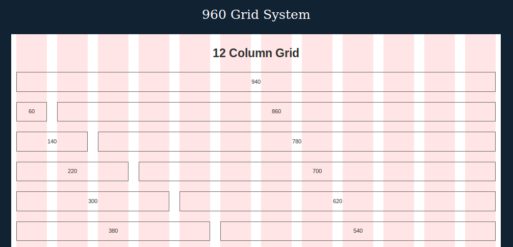
A grid (also known as a typographic grid) is a way to layout elements horizontally for consistent widths, spacing, and alignment. It's based on columns and gutters.
A column is space for content and a gutter is whitespace between columns. For elements that span multiple columns, then they will include their gutter in the width.
In the screenshot below, the red vertical bars are columns and the white vertical bars are gutters:
Screenshot from http://960.gs/demo.html
Examples:
The most common breakdown is 960px width overall with 12 columns and 12 gutters. Gutters can be placed to the left, right, or evenly split around columns. In Bootstrap and Foundation, they use left/right padding for an even split.
Vertical rhythm and baselines
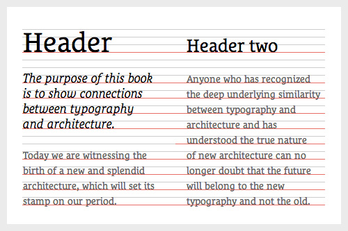
Vertical rhythm is how we guarantee consistent vertical placement and spacing.
We start with the concept of a baseline, a repeating vertical line throughout the page (e.g. a line every 16px). Then, we make sure paragraphs line up with that on every line break.
Larger elements (e.g. headings, images) can take up multiple lines (e.g. n * 16px) and should have paddding to match a baseline.
Image from http://www.smashingmagazine.com/2012/12/css-baseline-the-good-the-bad-and-the-ugly/
Examples:
Further reading:
Type hierarchy
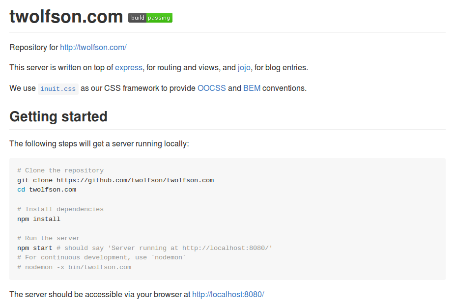
Type hiearchy is the usage of different sizes of type (e.g. h1, h2, bold) to indicate a relationship with nearby content (e.g. content under a heading).
In the screenshot below, "Getting started" indicates the code block is part of its instructions:
Beyond this, there are type scales which define how big/small each of the h1, h2, etc should be. These usually leverage ratios (e.g. major third, golden ratio).
Links:
Type scale is something that needs to be played with until it "looks right". Although, there is usually a relationship between baseline and type scale.
Typeface
Typefaces (also known as font-face in CSS) is the font being used for a given piece of text.
Serif typefaces are typefaces with "little lines" on characters. For example:
Image of Courier New by Inductiveload via Wikipedia, https://en.wikipedia.org/wiki/Courier_%28typeface%29
Sans-serif typefaces are typefaces without "little lines" ("sans" means without). For example:
Image of Arial by GearedBull via Wikipedia, https://en.wikipedia.org/wiki/Arial
Serif is typically good for being formal and helps with reading letters (e.g. can distinguish shape easier). On the other hand, sans-serif is more informal.
A different typeface shape can have its own utility. For example, they can:
- Establish a mood, http://www.fontsquirrel.com/fonts/lobster
- Identify a brand, http://www.dafont.com/loki-cola.font
Visual components
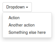
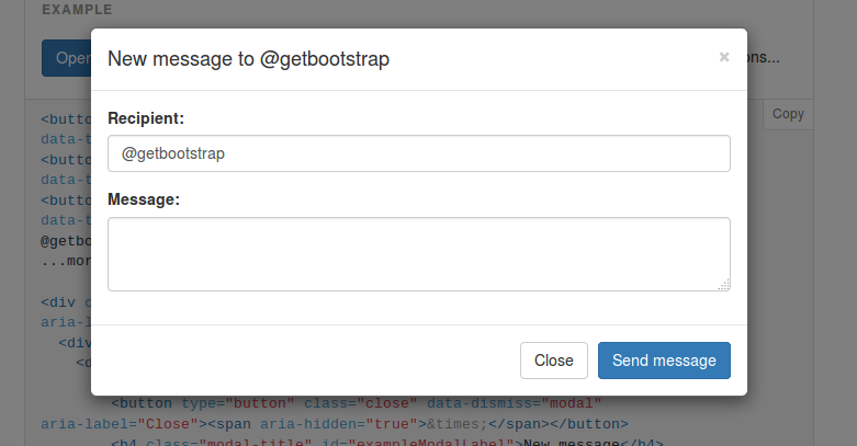
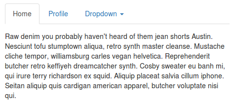
Visual components (also known as design patterns, although not the development kind) are visual elements that are created and reused within an application. Some common examples are:
A dropdown
A modal
Tabs
Screenshots from http://getbootstrap.com/
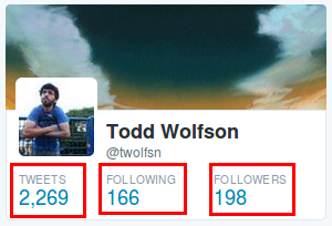
Beyond that, there are custom components that designers might create. For example, on Twitter we have pairs of "heading" and "number". In their CSS, it is named stat:
Screenshot from https://twitter.com/
If you are interested in learning more about structuring HTML/CSS after this model, please see the OOCSS section below.
Area alignment
As programmers, we like to automatically center things via the computer. However, this isn't always visually "correct".
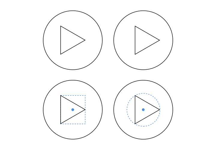
Sometimes there is an optical/visual center which isn't the actual left/right center (average). For example, in the image below the left button has an average center whereas the right button is optically centered:
Image from https://medium.com/@erqiudao/the-play-button-is-not-optical-alignment-4cea11bda175
In these scenarios, we need to either pad the image with transparent pixels or adjust positioning via CSS/HTML.
Further reading:
- "Area alignment" in Universal Principles of Design
- https://medium.com/@erqiudao/the-play-button-is-not-optical-alignment-4cea11bda175
Amendment
These rules are not hard and fast as in programming. Sometimes, the rules can be bent (e.g. using optical centering instead of average centering) and broken (e.g. give an element 20px of padding instead of 16px). The end goal is to get something that visually "looks right".
Applying our knowledge
To take this knowledge further, we can apply it to our existing sites with the following tools/philosophies.
OOCSS
A methodology to architect HTML/CSS around building visual components
- Introductory article: http://www.stubbornella.org/content/2010/06/25/the-media-object-saves-hundreds-of-lines-of-code/
- Site: http://oocss.org/
This will be counter-intuitive to conceptions about "semantic" HTML but it will be fine as it scales across multiple pages and products whereas "semantic" HTML does not (similar to Bootstrap).
Variations on OOCSS
Some more opinionated OOCSS philosophies can be found here:
- SMACSS, https://smacss.com/book/
- BEM, https://en.bem.info/method/key-concepts/
- Alternative naming convention (my preference), http://csswizardry.com/2013/01/mindbemding-getting-your-head-round-bem-syntax/
CSS framework vs UI toolkit
Tools like Bootstrap and Foundation are only practical if our design was initially based off of them. Otherwise, we will fight them at every turn. For example:
- Our baseline might be 1.5x our gutter width
- We might want all our baseline padding to be at the bottom
- We might want a dropdown in our navbar
On top of that, calling them "CSS frameworks" is a misnomer. During their construction, assumptions were made for each component (e.g. padding, visual style, use cases). As a result, they are complete products and we should refer to them as "UI toolkits".
A "CSS framework" gives us all the variables and 80% of the work completed so we can fill in the remainder without any fights. My favorite framework is:
- https://github.com/csswizardry/inuit.css
- Example of everything it provides: https://terabytenz.github.io/inuit.css-kitchensink/
This comparison should feel like comparing Wordpress/Drupal to Flask/Sinatra/Express.
Topics not covered
There were a bunch of design topics that we didn't cover in this article. Here are some high level interesting ones:
- Color theory, meaning behind colors and how they complement/constrast each other
- Personas, creating characters to explore different use cases
- Design process, multiple stages a designer may use while designing
- For example: Brainstorming, sketching, wireframing, mockups, prototyping, user testing
- Wireframes/mockups, visual documentation for an application
- Kerning, adjustment of spacing between text characters
- Optimal characters per line, http://practicaltypography.com/typography-in-ten-minutes.html
- Typography, field of design that focuses on building typefaces
- Iconography, attachment of meaning to icons to save visual space
- Context, design is best done in full context; be sure to include the surrounding environment in considerations/screenshots/mockups
Bonus: Communication
When working with designers if you feel like you are being left out and forced into nonconsensual decisions, then speak up.
The best design experience I had was working at Uber:
- We (engineers, product, designers) would start with a blue sky brainstorming session and throw out any ideas we had onto a board
- We voted on what ideas we thought were important
- Designers explored a few directions with a few wireframes
- Designers presented ideas, everyone gave feedback and we decided on which direction to go with
- When wireframes were done and high fidelty mockups were getting started, the same engineers started building the product
Since the engineers were involved in the early stages, we felt much more engaged and were much happier with the end result.
Links
Here are my top picks for content that have helped me learn about design:
