In typography, there is the notion of an optimal line length; an ideal amount of characters per line to make a section of text easier/faster to read.
For a single-column design measure should ideally lie between 40 & 80 characters. Many typographers consider the perfect measure to be 65 characters.
I have been considering to take on the experiment of applying this idea to code.
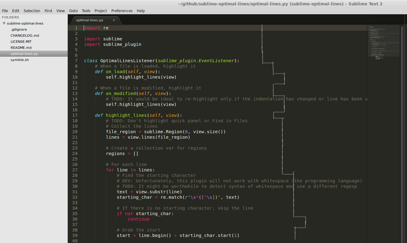
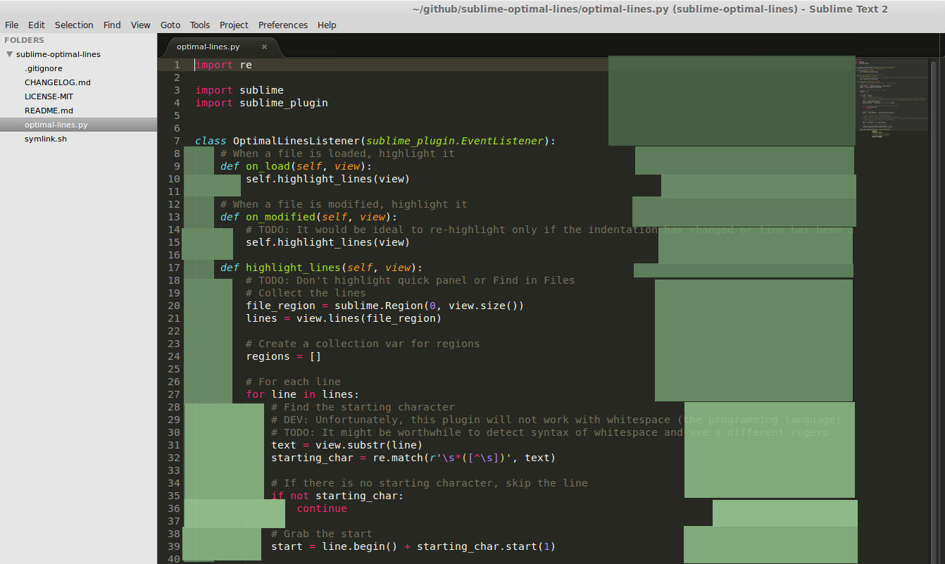
My execution would be placing a relative marker (e.g. ruler) 65 characters after the initial non-whitespace character. This would be used as a guide similar to the absolute 80 character limit that is frequently enforced.
Initially, I attempted a proof of concept plugin within Sublime Text but was stopped short by a lacking API; I was unable to draw outside of written characters. As a result, I took to pixlr and whipped up some more mockups.
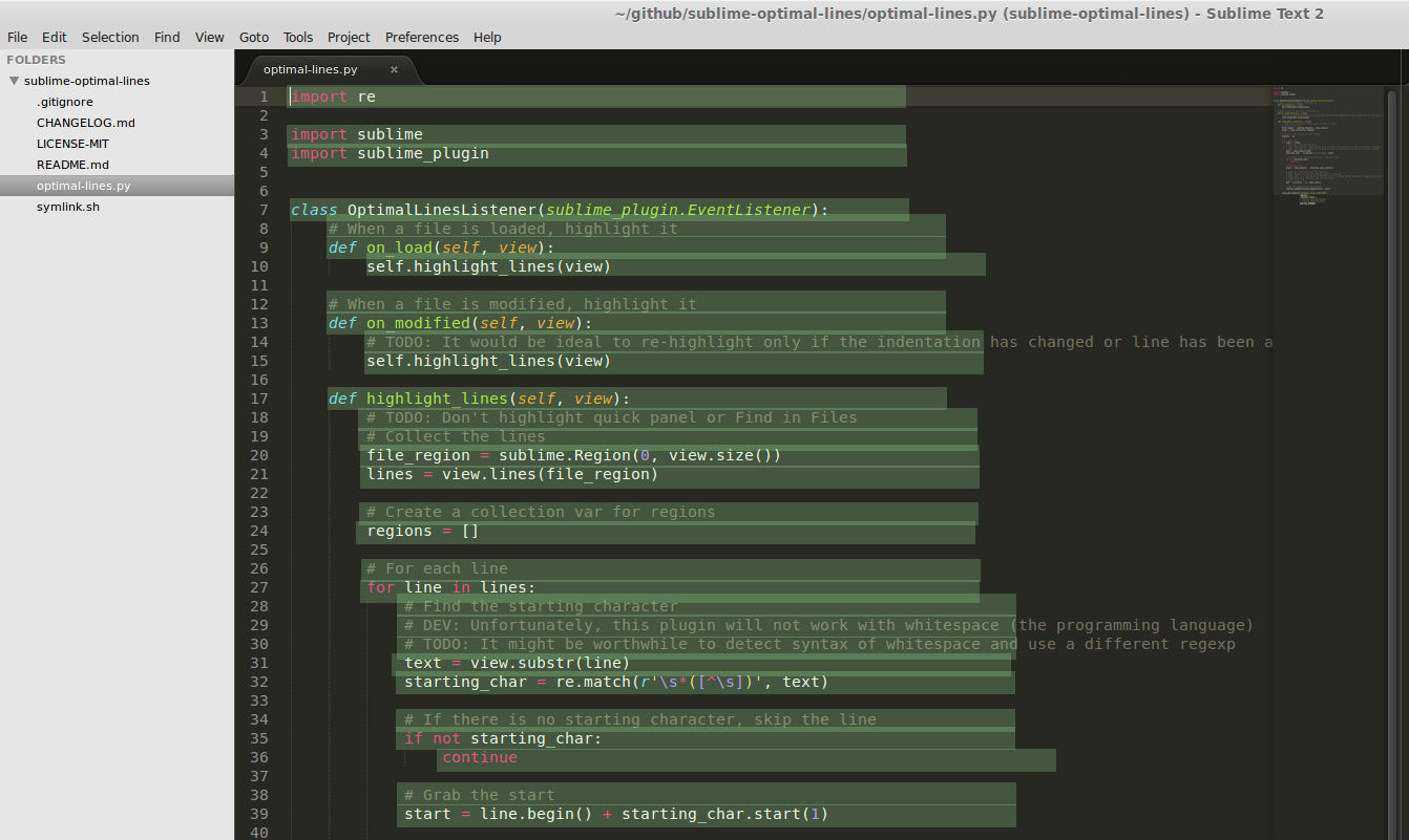
Highlighted sections
Concept: Highlight "good" areas to write code within
Reasoning: We want a guide to always present, even on good lines since it gives us something to aim for; pro-active rather than retro-active.
Flaws: The highlighting is overwhelming and draws attention away from code
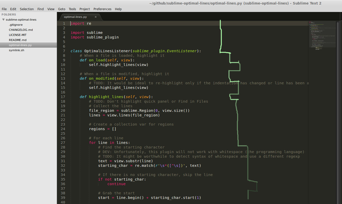
Colored ruler
Concept: Hint at level of scope to further visually separate indentation limitations.
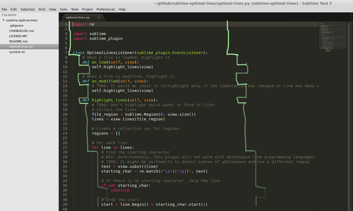
Double colored ruler
Concept: Provide a consistent even guide, similar to a track/rail.
Bordered content
Concept: Continuing with the rail concept but forcing focus to the content by blocking the outside (a la blinders).
